The Dark and the Wicked - Ryan McNeal
“I don’t know if I remember exactly the first project Tristan shot that I colored, but I believe it was a short film back in 2015 and was referral from our mutual friend and colleague George Nienhuis. Since then Tristan and I have worked on many music videos and commercials together. It’s great when there’s an existing relationship because you can skip right to the creative part. We were both excited to bring that relationship and experience to a long-form narrative project. Tristan continued to bring projects our way as I was growing our company. He has an easygoing personality and we have a similar aesthetic so working with him feels very natural.”
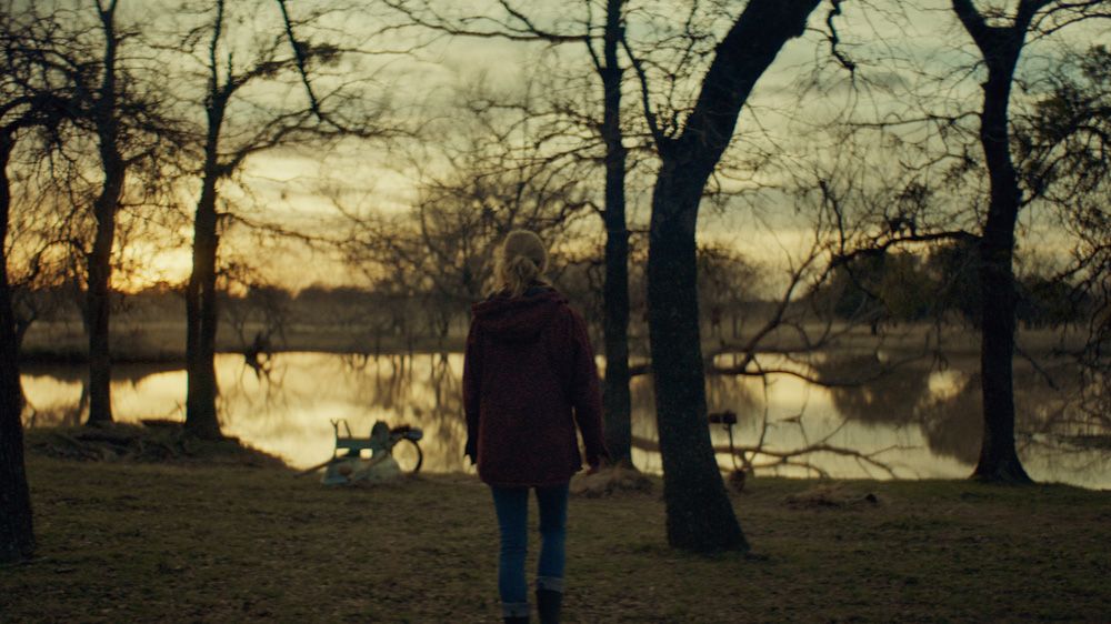
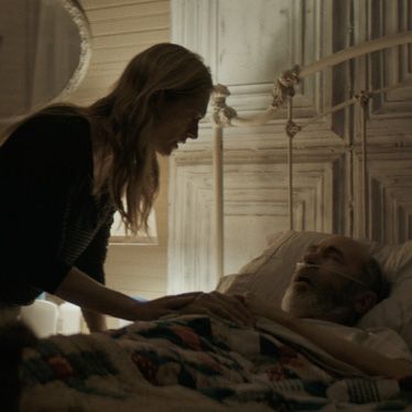
“The color process was pretty smooth sailing. Tristan and I knew what we wanted and were on the same page from the beginning. The main creative challenge we had was that the film is intentionally very dark, and we had to ride that line of being dark enough to convey the themes while still being watchable. For visual references, we considered films like “The Witch,” “Hereditary,” and other unsettling films. We also looked at a few Andrew Wyeth paintings as inspiration for the desaturated earth-tone palettes. He painted exclusively with self-made egg based tempera paints, which lacked the vibrant saturation of store-bought acrylic/oil.”
“Most of the techniques used for color were pretty standard for my workflow. My preference for working with grain is to apply it underneath all the color correction, which yields a more embedded feeling to the grain rather than a simple overlay at the end. Another technique that I use on the organizational side is I have a very structured node tree that is consistent from shot-to-shot and across projects. This allows me to make changes quickly across scenes and always understand what corrections I’ve applied at a glance. I’m a big believer in strict organization in an artist’s workflow and chaos in an artist’s creativity.”
“All projects that we do we copy onto our server, trimming shots to selects plus handles in order to reduce file size overhead.These selects get conformed into the color project.This workflow allows us real-time playback since our server is much faster than client drives, and allows us to retain a backup of the selects.That way the client drive is not needed to facilitate notes or future changes.This has saved us on a few projects over the years where clients have had drives fail and lost all their footage. We’ve been able to provide all they need to rebuild the picture.”
“After color we provide the graded selects with handles to the online editor, who re-assembles the edit and creates all the final deliverables. In this case our online editor was Alex “Splice” Jones who we have worked with for years. He created all of the final deliverables which we then sent to Simple DCP for DCP creation and archival.”
“The project was shot on Alexa Mini and I grade in DaVinci Resolve. For those interested in my setup I use the Resolve Mini panel, BlackMagic 4K scopes, and my workstation is a self-built 18-core system running MacOS. For the final day of color, we worked with Simple DCP in their theater color suite. We handled all post finishing at RKM and worked together with Simple DCP to provide all of the necessary distribution deliverables. It was a little challenging due to the sudden Covid changes to the industry and our business, but we were able to provide everything on schedule.”
“Covid hit right at the tail end of our part of The Dark and the Wicked. We had finished the grade before the first quarantine hit, and continued the online process in March. Aside from our transition out of our physical office and into an at-home setup, our workflow wasn’t strongly affected. However, the distribution plan for the film was out the window. Originally there was supposed to be a theatrical release, but with all the theaters closed they opted to screen at a handful of drive-in theaters instead and then release digitally on several platforms including iTunes, Shudder, Amazon, and Vudu.”
“It was a lot of fun to color and figure out the look in order to create the world of the film. I spent so much time delving into the bleak and dreary palette of this project that it was hard for me to switch gears for commercial and music video projects. Every time I switched to a music video or commercial, I’d keep feeling like those projects were too bright or too saturated and had to readjust my sense of “normal.” For music videos and commercials, the end goal is almost always to make the image look as beautiful as possible. With narrative, color is another tool to help tell the story, and it’s not always about making the images look beautiful but more about conveying the proper emotions. Sometimes that means the image should be devastating.”