Grading Fantastic Mr. Fox
"This was quite an inspiring film to work on, simply because The director had such a strong vision for the way he wanted ‘Fantastic Mr. Fox’ to look. I had been told that Wes was very much involved in all of the camera moves and placements during production, so I was a little surprised at how ‘hands-off’ he was with the color grade."
"In fact, Tristan Oliver, the DOP was very much driving the color decisions through out the grading process, with Wes coming in at the end of the day to check the overall progress. Wes seemed to be one of those directors that just has this ability to get people to do exactly what he wants of them. So in the end, he only had to come in every now and then to make sure it was all on track."
"Tristan was brilliant and seemed to know exactly what Wes was going for. I guess when a director and DOP are working together on an animation for 2-3 years at a time, they become very familiar with what the director wants! And Tristan, certainly seemed to intuitively know what would work."
"I have a great relationship with Tristan, having been the colorist on ‘The Curse of the Were-Rabbit’ which he shot for Aardman Productions. Knowing him reasonably well and having him so empowered to drive the direction of the grade, I think worked particularly well. Tristan had a brilliant sense of what looked nice and he seemed to understand Wes’ vision perfectly. So in the end, he was really able to bring out the full potential of what we were working with."
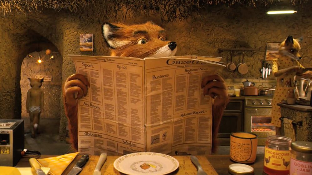
"Wes’ hallmark look is this extreme warm orange with everything having these super rich tones. When we were grading this film back in 2007, I was working for Technicolor and grading on the Quantel iQ. Not having a fully digital workflow at that stage, meant that we had to finish to film in order to get our sign offs."
"Basically, at the end of each days grading we would make up a two minuite test sequence that represented the shots that we had graded that day, shoot it to negative, print it, and then view it in the cinema the following day for approval. So every time there was a change, we would go through this massive process."
"With this extreme orange look to the film, we were basically hitting the end of the color curve in terms of what the translation will do - so you are not necessarily going to get those colours! We were going all out in terms of color saturations, from 140% saturation to 150%, and then to 160% saturation! So it was a little difficult sometimes to get exactly what Wes wanted, simply because the mechanical process of going out to film couldn’t get us there."
"In the end, we had to keep going out to film to show Wes and Tristan what we could actually achieve instead of relying on what we could see on screen. I found that pushing to 140% saturation, it actually looked pretty good!"
"It’s always such a pleasure to work animation people, because they are just so nice. Sadly, their productions take 3 years to 4 years do, so it always seems to take years and years before you can work with the same team again."